- SERVICES
- HIGHER EDUCATION MARKETING
- ENGAGEMENT & ENROLLMENT MANAGEMENT
- STUDENT RECRUITMENT AGENCIES
- PROFESSIONAL EDUCATION & TRAINING
- WHO WE ARE
WHO WE ARE
Learn more about Keystone Education Group, including our leadership structure, why choose Keystone as your educational partner, and company press releases.
QUICK LINKS
- RESOURCES
RESOURCES
Find a range of helpful resources to help with your educational marketing. From on-demand webinars, reports & data, to customer testimonials and our downloadable media kit.
QUICK LINKS
- NEWS
- REQUEST A CALL

- Keystone Higher Education News
- Best Practices for Using Paid Ads on Facebook and Instagram
Those working in higher education marketing will already know the value of using Facebook and Instagram campaigns or Meta Ads.
They are an excellent marketing tool to reach prospective students and as of August 2024, there were 1.02 billion users aged between 18-24 across Facebook and Instagram – 26.4% of its audience.
As experts in marketing analysis and Meta campaigns, we've come up with tips and best practices to help you achieve better results with your campaigns.
1. Optimize your social media creatives
The first thing your audience sees in a campaign is your photo or video. The effectiveness of your imagery determines whether the audience will pay attention to the ad.
Images and videos must be in 1:1 (square) and 9:16 (vertical) dimensions, as these fit for all placements and can take up a lot of 'real estate' on the screen. Horizontal assets also work for all placements and sometimes vertical assets also do. Sometimes we can optimise further than this.
Ideally, your video should be no longer than 60 seconds, with the first few seconds being eye-catching.
Here are some examples of the assets on campaigns we have done:
Image Ad Carousel Ad Video Ad
- Our delivery team, who have experience running hundreds of Campaigns, decide on a case-by-case basis if Meta Campaigns would be better run as separate ads/posts within the same Campaign or on a carousel, based largely on the assets provided. If you have a strong preference for one, please tell us, and we will see if we can accommodate this.
Content
- Branding is key. We highly recommend that all social media creatives include school names or logos. The title of the program or any other information you intend to leave an impression on the audience can also be included if space permits. We don’t recommend a lot of text.
- Designing images or selecting photos with bright colors. As students scroll through social media, sharp color contrast or bright colors are more likely to catch their attention and result in higher engagement.
- Avoiding generic or commercial content. Make content with a personal touch. Social media creatives should contain relevant, helpful content that will help students visualize the institution or program. Content such as campus views, classroom moments, and a fun student lifestyle are most engaging.
- Include subtitles in videos. Students can still see your message when their devices are muted.
2. Concise and engaging ad text
- Keep your message simple and concise. This will help students understand it more quickly. The ad text should not exceed 100 characters.
- Avoid general text. It is important that the text is relevant to what the campaign is attempting to promote. Boost your ads' impact by emphasizing an eye-catching point in the text.
3. Understand your target audience and geography
Audiences & Creatives
Do you have a program-focused or institution-focused campaign? That makes a difference in what types of creatives you should send.
My campaign is about drawing interest to my institution:
- We recommend sending a video and targeting it to the degree level(s) you’re promoting. Video campaigns offer you the opportunity to get the best reach and engagement that you’re seeking and highest ROI.
My campaign is about drawing interest to specific programs:
- When promoting based on program, we recommend doing carousel ads with 1:1 ratio image for each program. For the best impact, make sure that the different programs you feature fall into the same or related categories.
These ads offer tailored program options for students who are interested in studying in a specific discipline.
- For example: Providing three program options for students interested in Engineering will target your campaign more efficiently than a campaign offering three program options for Design, Business, and Engineering.
If you don’t have a range of programs within a specific discipline to promote, we would still recommend you do a carousel to feature similar categories. For example: Finance, Management, and Marketing, rather than Business, History, and Fashion.
Please note that while the vast majority of programs are fine to promote, Meta has restrictions on what can be promoted on its platform and, very occasionally, this can mean campaigns are rejected. If this happens, we will of course promote other content for you.
Targeting Geography
- Try to target countries within the same Tier. The Cost Per Conversion and Cost Per Clicks (CPC) vary greatly across countries. As a result of Meta's algorithm, most of the budget will be allocated to countries with cheaper CPCs or CPL to optimize the results. This, however, will result in an uneven distribution of the budget. There will be more leads or clicks coming from one or two specific target countries rather than across all geo-targeted countries.
Keystone Meta Ad Requirements
With over seven years of experience and significant investment in Meta advertising, we’ve developed a deep understanding of our audience’s behaviors and needs. This expertise allows us to effectively identify and connect with the right student profiles on Meta to match with our schools. It also helps us pinpoint what creative works best to engage students actively seeking higher education.
Below we outline what we need from you, why we need it, and we also give tips on how to run a campaign that gets the best results for you.
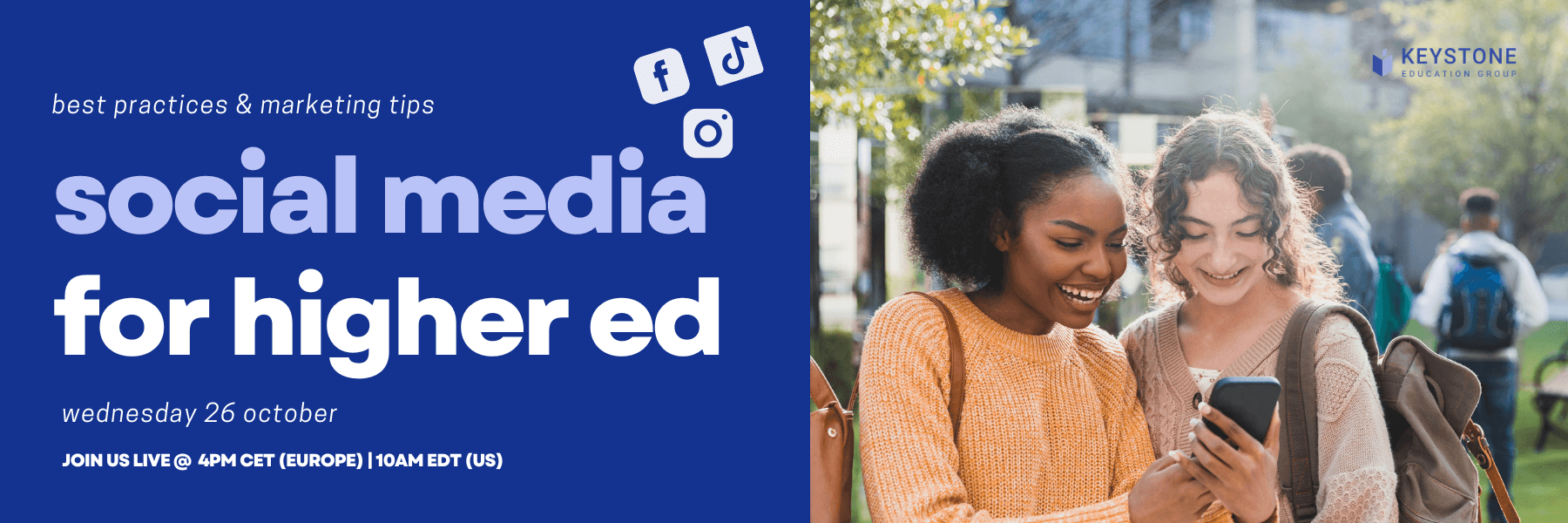
WATCH ON DEMAND WEBINAR:
Related Tags
Just For You
Top Picks
Higher Ed Chats Podcast
Listen to the latest episodes of our Higher Ed Chats Podcast - new format for 2024. Hear from Higher Ed thought-leaders from around the world!
Who Will Win The Keystone Awards?

Watch the Keystone Awards Ceremony to see the winners of the 2025 Keystone Awards!
Subscribe
to get the latest news and updates


